Do you have a sample to share in the gallery?
Project: create a visual resource to supplement a medical article about handling serious illness conversations. TCMP (This Changed My Practice) is a free online blog by UBC CPD (Continuing Professional Development) of the Faculty of Medicine. Launched in 2010, the blog provides its audience of health-care professionals tips, impactful clinical studies, and clinical pearls in bite-sized articles every two weeks. This article I was tasked to produce a visual about how health-care providers can speak to patients and their families about serious illnesses in a palliative and empathetic way. My objective for this project was to design and develop a visual resource that not only expresses the article’s content, but is a practical tool to help health-care providers improve their practice. The finished resource and its accompanying article can be viewed here: https://thischangedmypractice.com/palliative-care-conversations/
The first thing I had to do was figure out what sort of resource I wanted to design. Would it be an illustration? A flowchart? A guide? To figure this out, I read the draft version of the article. From this, I surmised that a practical “how to conduct serious illness conversation” guide would be the most useful type of resource that could supplement this article.
Of course, I don’t have a medical background, so I couldn’t trust my judgement alone. I brainstormed my idea with my supervisor, and sought feedback with the person in charge of the TCMP site. They approved my concept and highlighted chunks of info from their article they thought should be presented within the resource.
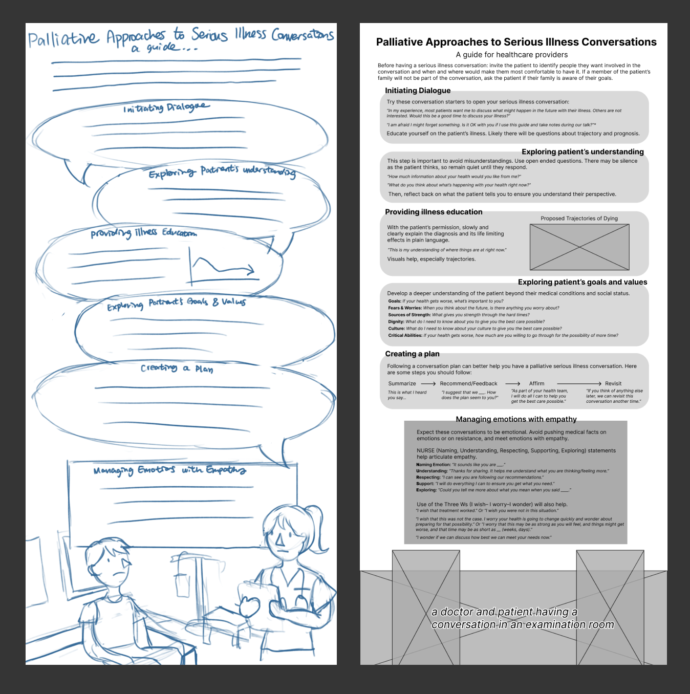
Then, it was time to figure out how I wanted all the information to be arranged. I decided this guide should be split into several clear steps, resembling a dialogue a health-care provider is having with a patient and a member of their family. Interspersed within these instructions should be example quotes the readers can utilize as conversation starters.
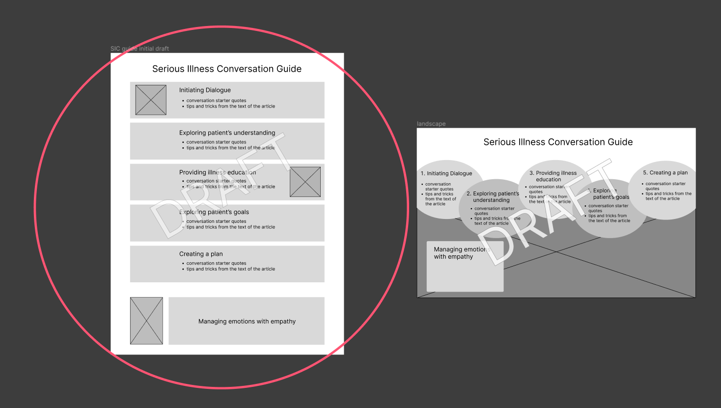
I created very bare-bones wireframes in Figma as a means of communicating my idea to the stakeholders in this project. The author approved the idea, and began to pick out specific quotes and pieces of information from their article to use in my resource.

After figuring out the rough layout of my resource, I worked on the illustration that would be the focal point of this document. Although it was only decorative, I thought it was important to have a point of visual interest so readers would have a break from all the text in the resource. I sketched, inked, and coloured this illustration in Procreate, being sure to implement UBC CPD brand colours to best match the theming of the site.

After receiving the finalized text from the author and finishing the illustration, it was finally time to lay everything out. I filled the final content in my wireframes. While the layout and styling of the resource looked good to me, this is where I ran into issues due to the sheer volume of text that I had to fit into my design.

Challenge: size and layout with regards to the amount of information
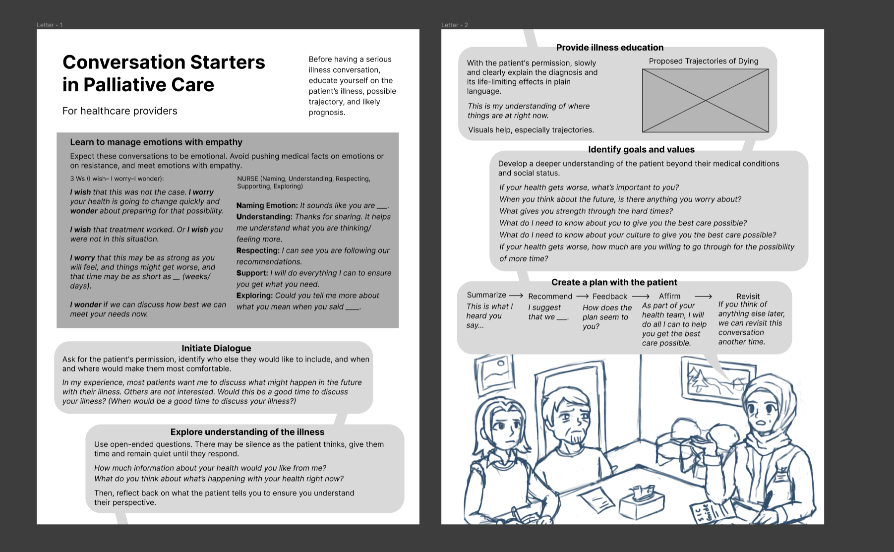
In a perfect world, the amount of text in this resource would fit perfectly within the design I had in mind. In reality, there were far more essential words than I anticipated. So much that it almost encompassed the entire article. Firstly, at my request, the author cut down as much of the resource text as they could, but it was still far too much text for the letter-sized frame I wanted all this information to settle in! So, I then tried making the size of the resource larger to fit all the information provided to me. This seemed to work well as a graphic, but would pose problems if readers of the article wished to print this guide out to use on the job. With any standard print size I tried to design this resource for, the text was far too small to comfortably read. Hitting a dead end with finding a good paper size I could use, I came up with a more creative way to have the resource print in a proper size. While the amount of text I had would not reasonably fit one letter-sized sheet, it could certainly fit two! With that decided, I re-designed the layout of the resource to be able to split nicely on two pages.
After solving my issue, I finally styled the text and boxes according to UBC CPD’s style guidelines. I also made sure to well-differentiate instructional text vs quotes by use of colour and font, so readers could easily pick out the quotes to use while they’re having conversations with patients With all that done, this resource was finally complete.

From this project, I learned to conduct thorough written communication. Because I had to gain approval, permission, and clarification from several different people on different matters, a lot of time was spent waiting for their responses before I could proceed further with the project. Due to this, I learned that I had to ask multiple things at a time and explain my perspective thoroughly as to not waste time with possible misunderstandings. From now on, I will communicate in this way for every project I work on with external stakeholders. I also learned to trust the expertise of stakeholders and understand the work they want from me may not always suit my creative vision. Throughout the process of making this resource, I was always worried about there being too much text on the design. I thought that it would be tiring to read and not visually pleasing. I tried to cut down the content as much as I could, but in the end, all the text that made it to the final resource was deemed necessary by the author. I still was not totally sure if keeping it all was the best approach, but I trusted their expertise and left it all in. To my surprise, when the article was officially released, I received immense praise for the resource I made from my co-workers as well as readers of the TCMP blog. No one mentioned any issue with the amount of text, and readers said my resource was a very useful and practical guideline for their practice! Now I know that sometimes it’s okay to sacrifice form for function.


