Do you have a sample to share in the gallery?
Over the past four months, I was tasked with developing ten e-learning modules for a course constructed by the Physician Quality Improvement (PQI) team at Vancouver Coastal Health (VCH). This course focused on a variety of topics like change management, cause and effect, quality improvement, and process mapping. When published, these educational materials will be accessible online to medical staff across the province. I worked closely with my project lead to transform storyboards for each module into engaging experiences supplemented by visuals and interactive components.
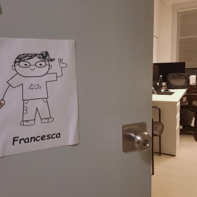
The first thing I did was write down phrases to articulate the qualities of the illustration so I could keep everything consistent and easily replicable. In the image, the visual design employs thin, outlines in black with bright-coloured, solid fills. The placement of line breaks mimics where a pen may be lifted in the drawing. It was helpful to know how simple these illustrations were to construct because the project included more than five modules and I could create iconography and illustrations unique to the content of each module. I was always able to ask the previous multimedia designer for help.
One of the features that I got more familiar with for this second term was the master slides feature. This is used to create a skeleton of various slide designs and interactions for each module. This feature helped reuse the same pattern for each section and the same menu animation without constantly duplicating everything. I also restructured the skeleton of each module so that the sections could be finished in any order before continuing to the ending section of the course. This, and implementing more back buttons allowed users to go back and revisit any part of the course even after they finished.
At the start of each module, I am handed a finished storyboard containing the copywriting, media (YouTube videos and photos), and, sometimes, notes about how the instructional designers envision interactions to play out. Most of the time, I have creative freedom for activities and layouts as long as they remain aligned with the content of the storyboard which I use as a guide. To bring content into Storyline, I make a rough layout of all texts and images on each slide to distinguish which content needs to be split up to avoid giving the viewer too much information. This rough layout lets me quickly bring in the content at once so it becomes ready to tweak into a better format. If stuck, I bring the design into Figma so I can iterate faster. After everything has been laid out, I start designing straight into Storyline. With quizzes, I reuse previous slides to save time. This extra time is spent on making other activities such as short answers, or drag-and-drop more engaging and tailored to their context.
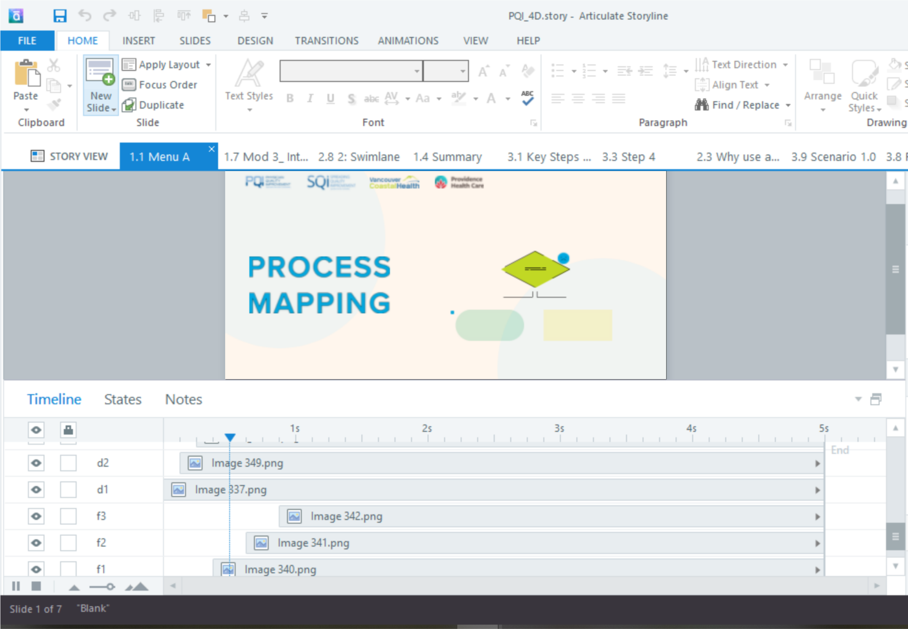
I wanted to experiment with more animation in Storyline. It was a simple way to increase the quality of each module. I created small illustrations inspired by illustrations I’d done for each module. When appropriate, I combined the graphics that I already created if needed. Then, I imported each layer of the graphic into Storyline for animation. Through my experimentation, I found that moving graphics looked best when I imported each stroke as a separate layer and animated it independently from the rest of the graphics.

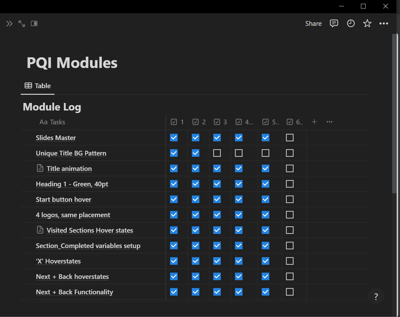
The previous designer had already completed three modules, however, the content needed to be updated, and the style needed to be more consistent. I was first tasked with constructing one module while improving two existing modules. With these first three, I learned how to construct the main visuals and repeated elements. After completing these, I consolidated details onto a table in Notion to make everything cohesive. Some details had me return to already completed modules and tweak because they looked better, or made things easier. This extra ‘quality assurance’ check helped elevate the course as a whole, and it was something my project manager praised me for.

One challenge that I often faced was repetitive text and image layouts. With this being a multi-module course, I wanted to find more creative compositions. I later learned that many people wanted to finish the modules as fast as they could. With that in mind, I wanted to allow them to do that by eliminating excessive clicks while making sure that they can recall content and revisit parts of each module after they’ve finished. To minimize the overall number of clicks, I opted for hovers to view quick bits of information before moving on. Returning to previous courses that the design team has done over the years was a helpful source of inspiration for layout and interactions. This gave me more ideas on how to present information with the tools available in Storyline.
Over time, I realized that not every layout had to be unique, as that did not impact the learner’s retention or flow of the course. Instead, I focused on maintaining a clean hierarchy for each layout, allowing myself to reuse compositions where appropriate. This allowed me the time to experiment with my creative freedom on more interactive slides.
Reflecting on my experience with prioritization during this project, I realized the importance of focusing on the main objectives set by my project manager. Initially, I found it challenging to resist the urge to tackle all the tasks, especially when I was used to striving to complete all the tasks I was given. However, the reassurance from my project manager and the PQI team reiterated the significance of prioritizing the modules above other smaller tasks they had planned for me. This shift in mindset allowed me to recognize that quality takes precedence over quantity and that my primary role revolved around seeing the course modules to completion for publication.
Furthermore, delving into the realm of hierarchy and information architecture proved to be enlightening. While these concepts are fundamental in design, their application within the context of organizing storyboard information for the e-learning modules significantly impacted the user experience. By dedicating a portion of my time to devising interactive methods of presenting content, I gained insight into establishing hierarchy effectively. Leveraging animations, motion graphics, and multilayered slides facilitated the seamless navigation of information for learners, enhancing their comprehension and engagement.
This journey sharpened my skills in prioritization and information architecture and instilled in me the importance of focusing efforts on core objectives and optimizing user experience through thoughtful design considerations.


